
Creating swatch cards that your buyers will actively use can transform how they interact with your fabrics and brand. When swatches are thoughtfully designed, they become tools that help buyers make decisions quickly and feel confident in their choices. If you are wondering how to design swatch cards that balance visual appeal with usability, there are several factors to consider.
Every element from layout and color placement to materials and branding contributes to how your buyers experience your products. Swatch cards can reflect your professionalism and the quality of your offerings while helping your clients work efficiently.
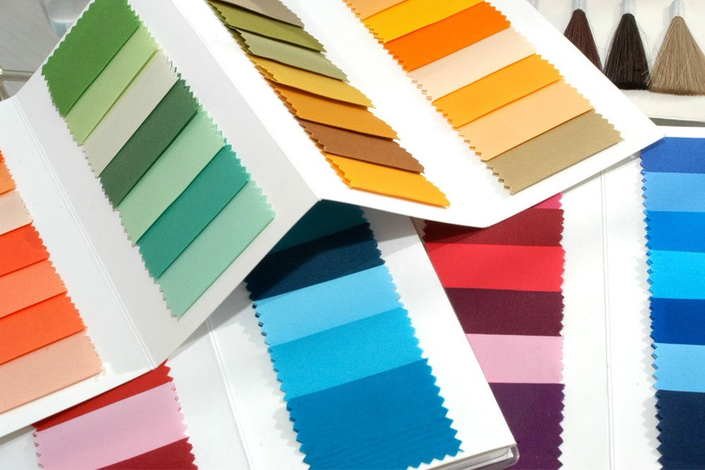
Consider How Buyers Will Use the Cards
When designing swatch cards, it is important to put yourself in the shoes of your buyers and understand exactly how they will interact with the samples.
Are they likely to carry them to client meetings, hold several cards side by side for comparison, or keep them stored in binders for future reference? Each of these scenarios affects choices such as card size, shape, and the way the swatches are arranged on the card.
For example, a card intended for quick comparisons may benefit from a vertical layout, while one meant for storage might work better in a compact, stackable format. Thinking through these details ensures that the swatch cards feel natural to use and fit seamlessly into the client’s workflow.
When your buyers find the cards easy to handle, access, and reference, they are more likely to reach for them regularly, increasing engagement with your fabrics and strengthening their perception of your professionalism.
Create a Clear Layout
A clear and thoughtfully designed layout is what allows your buyers to focus on the fabrics rather than struggle to interpret the card itself. Each swatch should be displayed in a way that emphasizes the fabric’s key qualities, including color, texture, and type, while keeping labels legible and organized. Using consistent fonts, spacing, and placement across all cards helps buyers recognize patterns and quickly understand how to navigate each collection.
Crowded or inconsistent layouts can make the cards feel confusing and reduce their usability, even if the fabrics themselves are exceptional. By keeping the design simple and logical, buyers can spend more time evaluating the fabrics rather than figuring out the layout.
Select Materials that Last
Swatch cards experience a lot of handling and transport. Choosing sturdy card stock and coatings that withstand wear will make the cards last longer and maintain a polished look. Buyers respond positively to swatches that arrive in excellent condition and stay in good shape through repeated use. Cards that feel solid and well-crafted also communicate attention to detail and professionalism without saying it outright.
Organize by Color or Fabric
Thoughtful organization makes your swatch cards more practical and appealing. Group cards by color palette, fabric type, or collection so buyers can find what they need quickly. Cards that are easy to navigate make the selection process faster and more enjoyable. When buyers spend less time searching, they can focus on creative decisions and projects. Organization shows that you understand your client’s needs and value their time.
Include Branding Subtly
Swatch cards offer a way to showcase your brand without distracting from the fabrics. Add a small logo or color accent to reflect your identity while keeping the main focus on the material. Buyers notice designs that feel professional and cohesive. A card that communicates your brand in a subtle way reinforces trust and familiarity with each interaction.
Provide Useful Fabric Details
Along with visual appeal, your swatch cards should provide information that helps buyers make decisions. Include details about fabric composition, suggested uses, or care tips. Short notes on complementary fabrics or current trends can add value. When buyers can reference practical information directly on the card, they spend less time searching for answers and more time working with your products.
Designing swatch cards that your buyers will actually use involves combining aesthetics with function. By thinking about how buyers interact with cards, keeping layouts clear, selecting materials that last, organizing by color or type, adding subtle branding, and providing helpful details, you create cards that clients reach for again and again.
Swatch cards that are easy to use and visually appealing make your fabrics more accessible and reinforce your reputation as a professional, reliable partner in the textile industry.
At the heart of this process, Harris Sample Book designs sample cards that combine quality and usability, helping your buyers explore, compare, and select fabrics with ease. Schedule an appointment to see how our swatch cards can elevate your fabric presentations.