
Swatch cards are a central tool in the textile and garment industry because they allow buyers and teams to evaluate fabrics quickly, accurately, and consistently. Understanding the right swatch card format makes it easier to showcase texture, color, and fabric qualities while keeping presentations organized and practical. The format you choose affects not only how a card looks but also how easily it is handled, compared, and stored.
Thoughtful swatch card design can enhance the experience for anyone reviewing fabrics, allowing buyers and teams to focus on evaluating material rather than deciphering layouts or labels. Swatch card formats are, therefore, practical tools that connect creativity with decision-making and help keep projects moving smoothly.
Choosing the Right Size for Your Cards
The size of a swatch card directly affects how fabrics are displayed and evaluated. Small cards may feel portable but can limit the space needed to show texture, weave, or subtle color shifts. Larger cards offer room for additional information, such as fabric composition, finish, or care instructions, while maintaining readability. Size also influences how cards are handled.
Cards that are too large may be difficult to transport or store, while cards that are too small may not give fabrics the presence they deserve. Consider how your buyers and teams will use the cards.
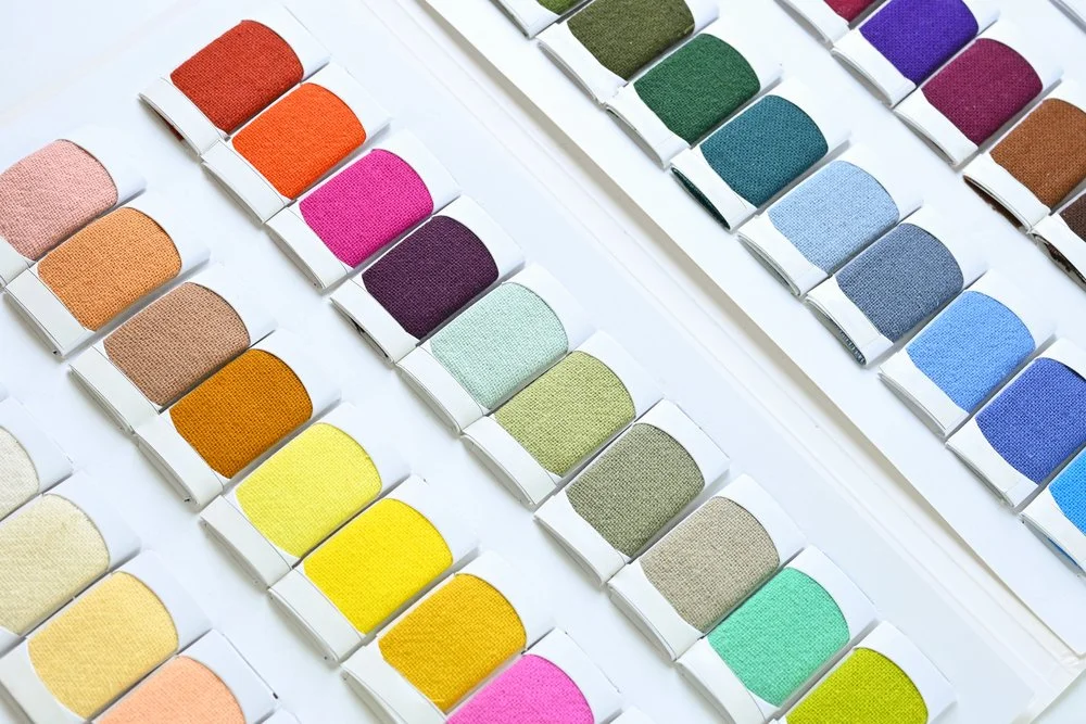
Exploring Shapes to Suit Your Presentation
The shape of a swatch card can affect both its appearance and functionality. Rectangular cards are the most common because they allow consistent placement of swatches and labels. Square cards provide symmetry and work well when uniformity is desired across a collection.
Custom shapes can reflect brand identity or highlight a special collection. Shape also affects storage and presentation. Vertical cards are easy to organize in binders, while horizontal cards can be displayed in sets or fanned out for comparison. By choosing a shape that aligns with how your swatch cards are reviewed and stored, you make handling easier and create a more cohesive presentation.
Arranging Swatches for Clarity
How fabrics are arranged on the card influences how buyers and teams perceive them. Consistent placement allows for fast evaluation and makes comparisons easier. Swatches can be organized by color, texture, or fabric type, depending on the goals of your presentation.
Clear organization keeps the focus on the material and reduces visual confusion during reviews. Well-arranged swatches also convey professionalism and attention to detail, which can leave a positive impression on buyers and internal teams. A consistent approach allows viewers to move through a palette quickly while understanding how each fabric relates to the overall collection.
Labeling and Information Placement
Labels are an important part of the swatch card format because they communicate information about each fabric. Buyers need to understand details such as fabric composition, finish, or intended use. Labels should be placed in a predictable location and formatted in a legible style so that information is easy to read.
Clear labeling allows buyers to reference fabrics quickly and reduces the chance of errors during evaluation or ordering. For internal teams, predictable placement helps with decision-making and tracking samples across different stages of development.
Thoughtful integration of labels into your card design makes the swatch card both informative and user-friendly, creating a smoother experience for everyone who interacts with it.
Presenting Cards for Maximum Impact
Beyond size, shape, and layout, the way swatch cards are presented affects usability. Cards can be displayed in sets, binders, or sample books, depending on how your buyers and teams prefer to interact with them. Presentation by color gradient allows for easy visual comparison, while organization by fabric type highlights performance differences. The method of presentation also includes card durability.
Cards made from sturdy materials or with protective finishes remain usable through repeated handling. Thoughtful presentation keeps the focus on fabrics, encourages engagement, and allows viewers to evaluate materials without distraction. A clear and well-structured presentation makes it easier to communicate the qualities and intentions behind your fabrics.
Maintaining Flexibility and Usability
Swatch card formats should allow for adaptation as collections or needs evolve. Adding new fabrics, reorganizing swatches, or adjusting labels should be possible without compromising clarity or aesthetics. Cards that can be modified without losing structure save time for both internal teams and buyers.
A swatch card format designed with usability in mind becomes a long-lasting tool that continues to serve your workflow over multiple collections. When cards are flexible, they remain practical resources that make fabric evaluation easier and more efficient throughout the lifecycle of a collection.
Schedule an appointment today to explore how Harris Sample Book can create swatch cards that showcase your fabrics effectively. Let us help you organize, present, and elevate your collections with clarity and professionalism.